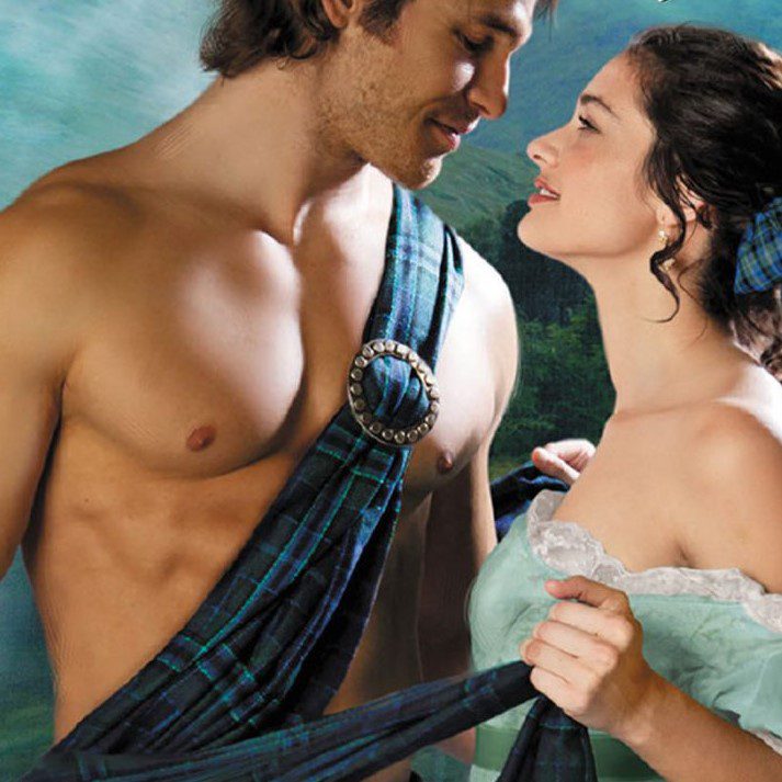
There’s been discussion on Bluesky lately about how publishing is moving away the traditional hunky shirtless stud-heaving bosom woman romance cover aesthetic—potentially because it is popular among self-published work, and traditional publishing wishes to differentiate itself further. Now, I’m generally not the target audience for romance novel covers, but it did get me thinking about what I value in book covers.
I am very much a Judge A Book By Its Cover kind of person. If I know about a book, and I want to read it, the book cover matters very little to me. However, if I’m set loose in a bookstore with nothing particular in mind, I purchase entirely based on cover. My typical genres are YA and horror/speculative/supernatural (often combined), but I also read literary as well. The library in my home office (two six-shelf bookcases, as opposed to my much larger six six-shelf library downstairs) is primarily devoted to YA and YA horror. I randomly picked five books from my collection with book covers I love:
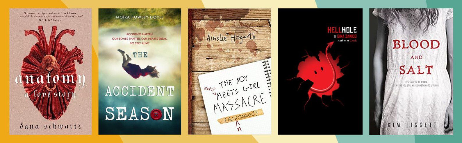
Most of these are a little older, owing to the fact that most of my reading is done on a Kindle these days—but I’d be willing to bet most of my favorite digital books there have this look, too. There are definitely some commonalities among those covers I picked. It’s a fair bet to say my aesthetic is exceedingly simple, spare, and bold—single image concepts, for the most part. Under normal circumstances I’d say that I am not overly fond of serif fonts, but the majority of these are—so maybe the real answer here is that I generally like very readable, bold fonts.
There’s a trend right now in YA books toward illustration, usually an illustration of the main character(s). I’m not super fond of that. To me it feels a little too cartoon-like… a little young. If we’re looking at who the audiences are for YA, yes, obviously we’re looking at teens—I’m sure some marketing team, after scads of marketing research, landed on illustrated characters as what really sells a book to the average sixteen-year-old. The first two books above could be illustrations, but they’re more photo-realistic looking than others I’ve seen recently. Harper’s summer 2023 YA book covers, for instance, have that characteristic in most of their fiction titles. It took me a minute to realize this, but they have an appearance I’ve come to associate with chick lit (a term I hate).
I suppose that makes sense in a weird way—an awful lot of YA is bought and read by adult women. This might be another way to lean away from self-publishers, too—original illustrated covers aren’t cheap, and many self-publishing writers don’t have the budget for it. My immediate reaction to cartoony, illustrated covers, though, is that they infantilize both groups of buyers (gee, infantilizing women and teens? Who would have heard of such a crazy thing? /s). It’s not like a lot of these illustrated covers aren’t pretty. They are. Some of them are gorgeous. Still, it might be time to buck the trend. Beyond my own personal opinions, the market is oversaturated with this look.
Interestingly (at least to me), YA horror does buck that aesthetic trend more often–with perhaps half of the titles I’m seeing recently being more in my aesthetic.
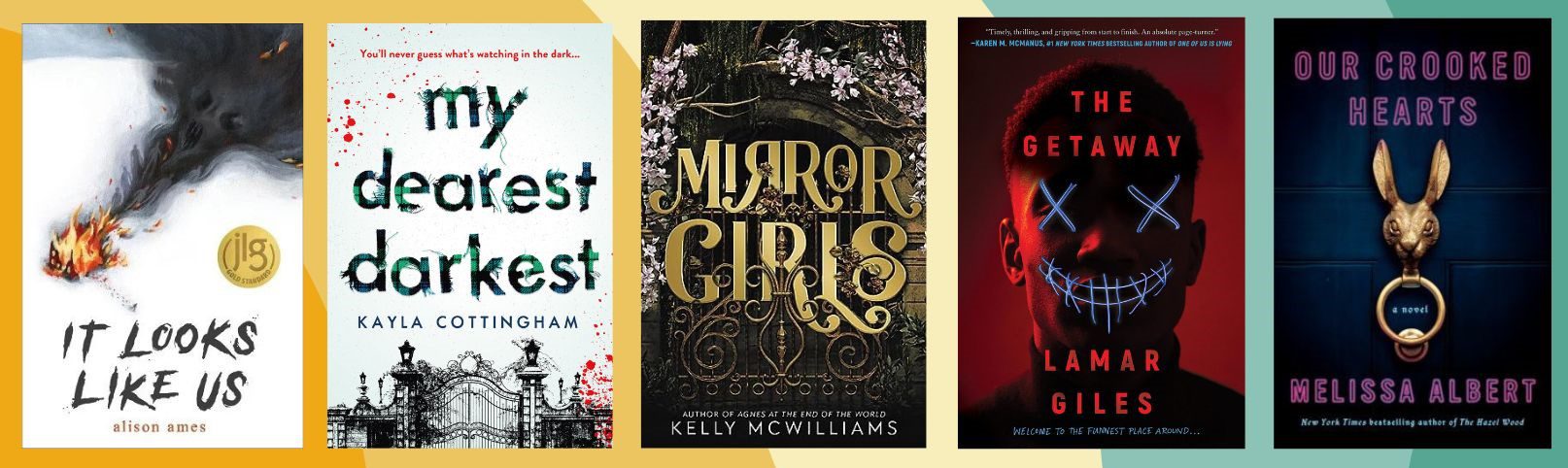
I haven’t read any of these, although all of them are on my TBR pile. And if I were wandering in a bookstore, they’re absolutely what I would pick up based on cover alone. Nothing too busy or messy, good readable fonts—confident and bold covers that have a point of view. That’s the joy of a great book cover design that appeals to you personally.